
Views: 0 Author: Site Editor Publish Time: 2026-09-21 Origin: Site


Article Intro: Dark jewelry packaging is the shortest route to a premium read without a structural redesign. A deep ground makes metal look brighter, hides the seam lines that show on pale boards, and photographs cleanly under the warm light most brands use for product shots. What it does not do is forgive: dye lots move on fabric, pile direction splits one tone into two shades, and ink behaves differently on a dark substrate than it does on ivory. This guide covers the tones, how each surface behaves in production, how deep tones are finished, and what changes when a tone is bought from stock rather than custom-dyed.
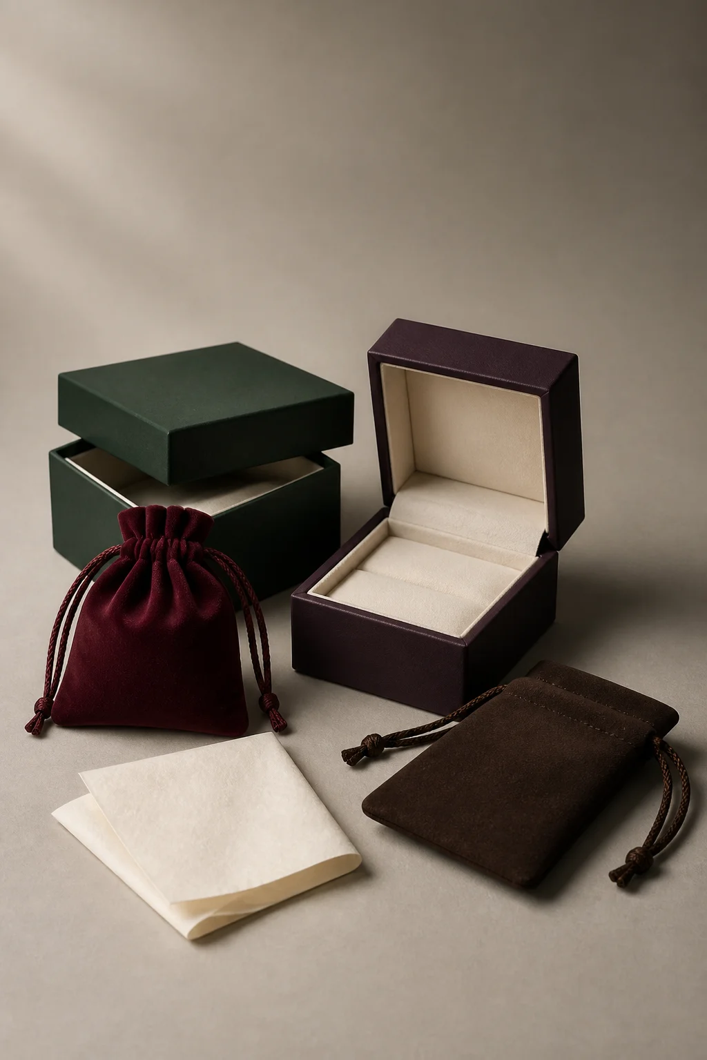
Four deep tones side by side — forest green, aubergine purple, burgundy and chocolate brown, with the pale interior doing the contrast work
Dark jewelry packaging is any box, pouch or paper carrier built on a deep ground: forest and pine greens, aubergine and plum purples, burgundy, wine and maroon reds, and the browns that sit between chocolate and espresso. Because a deep surface absorbs most of the light that reaches it, the contrast a brand would normally get from colour has to come from somewhere else — foil, hardware, or what is inside the box.
That single behaviour is why dark green jewelry boxes and their equivalents in every other deep tone follow one shared set of rules: contrast is added in a light material, the interior matters as much as the exterior, and a small deviation in tone is far more visible than it would be on beige or ivory.
Quick Answer: Choose the tone from the metal it will sit next to, not from a colour chart. Gold and brass flatter deep greens, burgundies and browns; silver and rose gold flatter aubergine and plum. Then decide the interior, because a cream or ivory lining does more for a dark exterior than any additional finish: it is what the customer sees when the box opens, and what keeps the piece visible against the ground.
Five tones cover almost every brief, and each carries a different risk once it reaches production.
Tone | Reads as | Pairs with | Production risk |
|---|---|---|---|
Forest and pine green | Heritage, botanical, unisex | Gold foil, ivory interior, brass hardware | Green dyes shift most between lots; matte finishes show it first |
Aubergine and plum purple | Editorial, boutique, limited edition | Silver or rose gold foil, pale interiors | Reads brown under warm light; needs a dyed lining rather than a printed one |
Burgundy, wine and maroon | Gifting, bridal, heritage | Gold foil, cream interior, satin ribbon | Red ink on a red ground disappears; the mark has to be foil or deboss |
Chocolate and espresso brown | Natural, handcrafted, leather-led | Copper or bronze foil, linen interior | Scuffs and pile marks appear first on brown suede |
Near-black with a cast | Minimal, luxury, retail standard | Any foil, any interior | Blue-cast blacks drift cold; check them against the metal they sit beside |
The tone also decides what the mark can do. A dark purple jewelry box that reads aubergine on a shelf will read brown under a warm retail lamp, so the logo treatment has to survive both. In jewelry box packaging dark red is the tone where print fails most often, and maroon jewelry box packaging shares the problem in a softer register: red ink on a red or maroon ground has almost no contrast, so the mark has to be foil-stamped or debossed rather than printed. A deep purple jewelry box with earring card insert is a different case again, since the card's pale edge against the dark ground is the contrast the tone was chosen for — which is why the insert stays light even when everything around it is dark.
Brand Background: The buyer is an Australia-based jewelry brand selling through its own storefront and a wholesale channel, and its lines ship in a pouch rather than a box. The brief was a deep-toned microfiber pouch built to a fixed specification: 200gsm microfiber, a two-colour logo, and each pouch packed in its own OPP bag, with quotes requested across three quantities so the brand could weigh volume against cash.
The Packaging Challenge: Two colours on a dyed substrate are the point where a swatch stops being reliable. The dye of the pouch and the ink of the logo sit on the same surface, so the colourway had to be judged against the actual material rather than against a paper chip, and the quantity tier had to be chosen without yet knowing how the print would read. A tone that looks right on screen and wrong in the hand becomes a bulk-production problem rather than a design problem.
The Procurement Decision: The supplier quoted the three tiers side by side — 5,000, 7,500 and 10,000 pieces — rather than returning a single figure, and set out production at 22-25 days with the two shipping options costed separately. Rather than leave the buyer choosing blind, the supplier produced a digital proof of the logo so both colours could be judged against the 200gsm material and the pouch dye before the order moved.
The Solution: The order was released at 5,000 pieces on the confirmed 200gsm specification, with the two-colour logo approved on the proof and every pouch individually bagged, shipped under DDP terms so the delivered figure was fixed before dispatch.
Measurable Results: The order closed at a $822.50 DDP total on 5,000 pouches, with the colourway and the material specification confirmed against a proof instead of being left to bulk. For a brand that had not previously specified a two-colour mark on dyed fabric, the practical value was that the tier quotes and the proof arrived together: the quantity decision and the colour decision were made in one step rather than one after the other.
The pattern generalises beyond this order: on a dark ground, the approval that matters is the proof against the substrate, not the swatch against the screen.
Four behaviours separate a deep ground from a light one, and all four are settled at specification rather than at final inspection.
Pile direction. Velvet and suede catch light directionally, so a single dyed tone reads as two shades across one panel depending on which way the pile is brushed. On ivory the effect is subtle; on chocolate, burgundy or forest green it is the first thing a customer notices. The fix is a cutting instruction, not a dye instruction: run the pile the same way on every panel.
Dye lot consistency. Deep greens and burgundies are where fabric lots drift furthest, because the dye load is high. A 500-piece run and a 5,000-piece run of the same reference can sit close together or visibly apart, which is why a repeat order is matched against a retained sample, not a photograph.
Contrast inside the box. A dark exterior with a dark interior leaves the piece nowhere to sit visually. Cream, ivory or pale grey linings are a functional choice as much as a style one: they make a ring visible in the open box.
Who handles the surface. Dark matte surfaces show fingerprints, dark gloss surfaces show micro-scratches, and both show more than a pale board does. For pieces a customer picks up daily, a soft-touch matte finish with a light interior is the more practical pairing.
How the mark sits on the surface is decided at the same stage. Dark brown velvet jewelry boxes with custom logo work best when the mark is debossed or foil-stamped rather than printed, because a printed mark loses definition in the pile. Where the brief calls for a burgundy purple jewelry paper box, the rule changes material rather than logic: paper takes a printed mark better than fabric, but a deep printed ground still needs the mark in foil or in a pale ink that has been proofed against the actual stock.
A wine red suede jewelry pouch and a velvet jewelry bag burgundy in tone both depend on the pile's light response to hold their depth, so specifying pile direction keeps the tone consistent — specify nothing and the same bag can look two-tone within one order.
Finishing decides whether a deep tone works: every finish changes how the surface handles light.
Advantages of a matte soft-touch surface:
Hides fingerprints and light handling marks better than gloss, which matters on pieces that leave the shelf often.
Photographs without specular hotspots, so one set of product images works across the range.
Lets foil and debossing stand out, with no competing reflection over them.
Drawbacks of a matte soft-touch surface:
Absorbs light, so a very dark tone can read flat under low retail lighting.
Oily marks can be harder to wipe out of a soft-touch coating than off gloss.
Advantages of satin and gloss:
Depth: a satin or gloss finish gives a dark tone a deeper, wetter look without changing the dye.
Cleanability on a retail counter, where a wipe-down is routine.
Drawbacks of satin and gloss:
Micro-scratches and dust show immediately, and deep tones show them more than light ones do.
Reflection can obscure a small debossed mark in photographs.
Foil and deboss: on a dark ground, gold or silver foil carries the highest contrast and a deboss carries the most texture — and a deboss needs no ink match, which removes an approval step from the schedule. The trade-off is that foil cannot be matched to a Pantone reference as precisely as ink can, and a deboss disappears if the pile or board is too soft to hold an edge.
Deep tones can be bought two ways, and the difference is minimums rather than quality.
Route | What it gives you | Typical minimum | Lead time |
|---|---|---|---|
Ready stock tones | A fixed palette of deep tones — burgundy, black, navy, deep green — often with the lid and base already tooled | Low, from a few hundred units per size | Days, because only the closure or a label changes |
Custom-dyed fabric | The exact tone matched to a Pantone reference and dyed for the run | 1,000-5,000 units, depending on the fabric | 3-4 weeks after approval, plus a dye sample |
Custom-printed board | The tone printed on board for paper boxes and carriers rather than dyed | 1,000 units typical | 3-4 weeks after artwork approval |
The practical sequence for a brand building a deep range is usually mixed: launch on a ready stock jewelry box burgundy color or a stock deep green, and move to a custom-dyed tone once the range has proved itself and the volume supports the minimum.
Unit economics follow the usual pattern. At typical 2026 factory quotes a custom rigid retail box lands around $1.60-$2.10 per unit at a 1,000-piece minimum, easing to roughly $0.90 at 10,000 pieces, while a pouch in a deep stock tone starts far lower at logo-print volumes (typical 2026 figures). Where a brand needs help comparing minimums, sampling and tiered pricing, the wider framework is set out in the 2026 B2B sourcing guide for small and growing brands.
Q: Which deep tone sells best for a premium line?
A: Forest green and burgundy carry the most gift intent, because both read as traditional, while aubergine and plum read as editorial and are usually chosen for limited editions. The better question is which tone flatters the metal in the range: gold and brass sit well on greens, reds and browns, and silver and rose gold sit well on aubergine and blue-cast blacks.
Q: Will a dark interior hurt the unboxing moment?
A: A dark exterior with a dark interior does, because the piece has nowhere to sit visually. A cream, ivory or pale grey lining is the cheapest way to fix it, and it costs less than any change to the outside of the box.
Q: Does a deep-dyed lining tarnish silver?
A: Tarnish is driven by sulphur and moisture, and some leathers, adhesives and dyes carry sulphur compounds. Where silver or silver-plated pieces are stored in a dark lined box, specify a lining and an adhesive that have been tarnish-tested rather than assuming any dark fabric is safe.
Q: Can deep tones be ordered without a custom dyeing minimum?
A: Yes. Stock deep tones — burgundy, black, navy and green among them — run at low minimums, because the tone is already in production. Custom dyeing carries the higher minimum and the 3-4 week window, so it is usually reserved for a range that has proved its volume.
Dark jewelry packaging works on one principle: a deep ground absorbs light, so contrast has to come from metal, foil or the interior rather than from the colour itself. The five tones behave differently in production — greens and burgundies drift furthest between dye lots, aubergine shifts brown under warm light, browns show handling marks first, blue-cast blacks drift cold — while the rules that apply to all of them are identical: run the pile direction consistently, keep the interior light, and choose foil or deboss wherever ink would disappear into the ground. Sourcing is a minimums decision rather than a quality one, with stock tones available at low volumes and custom dyeing starting where a range has proved its volume. The one approval worth insisting on for any deep tone is the proof against the real substrate, since a swatch against a screen tells you almost nothing about how the finished colourway will read in the hand.
Utouch Packaging produces custom jewelry packaging in deep tones — velvet, suede and PU leather boxes, drawstring pouches, printed paper boxes and die-cut inserts — with the tone, the pile direction and the mark confirmed against a proof before production. For wholesale and custom enquiries, visit the Utouch Packaging contact page or reach the export team through Xiamen Yu Touch Imp. & Exp. Co., Ltd.
