
Views: 0 Author: Site Editor Publish Time: 2026-09-18 Origin: Site


Article Intro: Navy blue jewelry packaging is the dark end of the category that is not black: a deep, cool-neutral surface that flatters gold and silver alike, photographs with more depth than a flat black, and reads as considered rather than generic. It is also the dark family where lighting and dye lots do the most damage, because blue drifts towards purple under warm light and towards black in a dim retail case. This guide covers the blue family from midnight to petrol, how navy compares with black, how the tone behaves under real lighting, where blue reads best across materials, decoration on a dark ground, and the two-tone and magnetic-box formats where navy is most often specified.
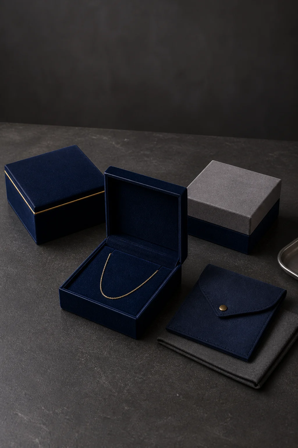
The blue family in one frame — a navy velvet magnetic box closed and open on a gold chain, a navy suede flap pouch, and a grey-lid two-tone box on a navy base
A navy jewelry box or pouch is a dark blue applied across standard constructions: magnetic rigid boxes, two-part lid-and-base boxes, flap pouches, drawstring pouches and printed sleeves. Nothing about the build changes because the surface is blue rather than black — the same greyboard, the same wrap, the same insert. What changes is how the tone is judged: in lighting, in relation to the metal it holds, and against the other dark surfaces in the range.
Navy is normally specified as a stock dark blue fabric or paper, a dyed-to-match blue, or a printed blue on paper and board. Printed navy is the most repeatable and the most opaque; stock fabric colours are the most economical; dyed-to-match gives the widest choice and the widest batch variation. On velvet or suede, surface depth means two pieces from the same dye lot can still read differently depending on which way the pile lies.
Quick Answer: Navy blue jewelry packaging gives a brand the weight of a dark box without the harshness of black, and pairs with gold, silver and rose gold in a way black cannot. It works best when the tone is specified as a narrow target with a stated tolerance, approved under the lighting the packaging will be seen in, and matched across every construction in the range. The two failure modes are tone drift between dye lots and a blue that collapses into black in dim light.
Four blue families cover most briefs. The difference between them is how much grey or green sits under the blue, and that decides which metals and which collections they suit.
Blue tone | Undertone | Pairs best with | Main risk |
|---|---|---|---|
Midnight | Blue-black, almost no grey | Gold, high-value bridal and fine jewellery | Collapses into black under dim light |
Classic navy | Blue with a slight grey base | Gold, silver and rose gold alike | The tone retailers call navy varies widely, so it must be pinned down |
Royal and cobalt | Saturated, brighter blue | Fashion lines, silver, enamel and coloured stone | Reads as playful rather than premium in a gift box |
Petrol and grey-blue | Blue with a green-grey cast | Platinum, unisex and minimal collections | Turns grey under cool retail light |
The practical point is that “navy” is not one colour. A dark blue jewelry box specified from a photograph and a dark blue jewelry box specified from a fabric swatch will not be the same blue, and the gap is large enough to matter when a brand runs boxes and pouches from different suppliers of the same range.
Both are dark, and both are used for the same premium position. The differences show up in the details.
Where navy wins over black:
Metal pairing. Navy carries gold, silver and rose gold equally well. Black pushes towards one and looks harder beside the other.
Photographic depth. A dark blue surface keeps a gradient of tone where black flattens into a silhouette.
Softer retail presence. Navy reads as considered and slightly warm where black reads as formal or austere, which suits bridal, heirloom and gifting lines.
Less severe about marks. Dust and light scuffing show on black as a pale film; on navy they are absorbed by the blue undertone.
Where black wins over navy:
Maximum contrast. Foil and print stand out most sharply on black, and a white or silver mark is most legible there.
Consistency. Black is the easiest dark tone to hold between batches and between materials; blue is the one that drifts.
Lighting independence. A black box looks the same in a bright showroom and a dim counter; a navy box does not.
Range simplicity. Black sits beside almost any colour in a line; navy has to be managed against other blues and greys.
The usual resolution is to keep black as the standard dark and use navy where the packaging has to feel warmer or more specific — a bridal range, a heritage story, or a capsule with its own identity.
Blue is the most light-sensitive dark tone in packaging, and that is the specification most often missed. Three effects are worth planning for.
Warm light pushes navy towards purple. Under a warm or amber-dominant source, a blue with a red undertone reads violet, which is why blue packaging should be approved under the light it will be sold in rather than in a neutral studio.
Dim light collapses navy towards black. Midnight blue has very little grey in it and disappears in a dim counter, which removes the reason for choosing it in the first place.
Pile direction moves the tone. Velvet and suede show a directional change in tone: the same navy reads lighter brushed one way and deeper the other, so a sample photographed flat is not proof of how the packed box will look.
The commercial consequence is simple: specify a narrower tolerance on a dark blue jewelry packaging programme than on a black one, and put the lighting test into the sample approval rather than discovering it in a retail photograph.
The same navy behaves differently on every substrate, and the differences matter more on a dark saturated tone than on a neutral.
Material | How the blue reads | Behaviour in service |
|---|---|---|
Velvet | Deepest and most saturated, changes with pile direction | Premium feel; marks recover by brushing |
Suede | Even and matte, closest to a flat swatch | The most consistent navy across a run |
Satin | Luminous, shows the blue brightest at the fold | Creases and pulled threads are visible |
Microfiber | Flat with a slightly cooler cast | The cleanest dark surface for print and deboss |
PU leather | Uniform and reflective, holds a crisp navy | Best scuff resistance; creases at the hinge |
Coated paper and board | Exact to the printed reference | Edges chip white where the board core shows |
Two of those rows decide most orders. A navy jewelry pouch in velvet or satin gives the deepest colour but the least repeatable one; a navy jewelry box in PU leather or coated board gives the tightest colour control and the weakest hand-feel. The chipping note on board catches buyers out: on a dark printed surface a knocked edge exposes a light core, which is far more visible than the same defect on a mid tone.
Dark surfaces invert the rules that apply on a light box, so the decoration brief for navy is a different conversation.
Gold and rose gold foil are the strongest options. They read on navy at a smaller size than they would on black, because the blue behind them has more colour and less contrast.
Silver foil is weaker than expected. Cool foil on a cool ground reduces contrast, so a silver mark usually needs to be larger or to be replaced by a white screen print.
Blind deboss nearly disappears. Tone-on-tone embossing, elegant on a light neutral, is barely visible on navy unless the light rakes across it.
Fine detail fills in. Small type and thin rules lose definition on pile fabrics, so dark-ground artwork is usually simplified and enlarged.
In practice a navy jewelry packaging custom logo programme runs best with one confident mark: a single foil at a comfortably large size, placed on the lid face or centred on a pouch flap, with the rest of the decoration carried by the colour rather than by print.
Most navy business does not arrive as a single blue box; it arrives as a system.
The first system is the two-tone set. Navy and gray jewelry boxes are the most common combination in this family, with a grey lid on a navy base or the reverse; the colour break runs along the lid seam and has to be cut exactly, because a wavy break on a two-colour build is more visible than on a single colour. Two-tone lets one range cover two positions: the grey side for silver-toned lines and the navy side for gold.
The second is the magnetic box. Navy blue magnetic jewelry packaging is a standard premium format: a rigid interior with concealed magnets, a flap or two-part lid, and a lid face large enough for a foil mark. The build is unchanged from any magnetic box, but navy raises two points. Magnets and exposed board edges must be fully covered, because a light core showing at the edge of a dark box is the defect that gets noticed. And the lid face, the flattest and most visible decoration area on the format, is usually kept in a single tone so the foil does not compete with a pattern.
A third pattern, a packaging for jewelry navy blue kit, combines a box, a pouch and a card in the same tone so the unboxing sequence stays consistent. It is the version that most often exposes a tone problem, because a pouch, a box wrap and a printed card are three substrates and rarely land on the same blue without deliberate matching.
MOQ follows the substrate. A stock navy carries the same minimum as the same construction in any colour. A dyed-to-match blue is where the minimum rises, and the reason is the dyeing run rather than the colour itself.
Ask about the dye lot before the second order. Fabric is dyed in lots, so a navy programme spanning several lots should be planned around that: keep a signed standard, ask how the supplier checks a new lot against it, and expect the second order to be matched to the standard rather than to the first delivery.
Decoration sets the schedule. Stitching and wrapping of a dark fabric move at normal speed; foil, printing, two-tone assembly and personalisation add the days, and a two-colour build adds a separate assembly step. The step buyers most often underestimate is colour approval, which sits before production and cannot be recovered afterwards. For the wider picture on minimums, sampling, tiered pricing and supplier qualification in custom jewelry packaging sourcing, see the 2026 B2B sourcing guide for small and growing brands.
Q: Is navy better than black for jewelry packaging?
A: It depends on the collection rather than on quality. Navy pairs with gold, silver and rose gold and photographs with more depth; black gives the strongest foil contrast, the most consistent batches and the same appearance in any lighting. Many brands keep both and use navy where the packaging has to feel warmer.
Q: Why does navy look purple in some photographs?
A: Because the light source has a warm cast, or because the fabric has a red undertone the camera exaggerates. Approving the blue under the lighting it will be sold in, and specifying a tolerance rather than a single reference, removes most of this.
Q: Can navy packaging be printed instead of dyed?
A: On paper and board yes, and printed navy gives the tightest control. On velvet, suede and satin the tone comes from the fabric, so it is either a stock colour or a dyed-to-match run — and dyed-to-match is what raises the minimum and introduces lot variation.
Q: What decoration works best on a navy box?
A: A single gold or rose gold foil mark at a comfortable size, and screen-printed white where a cooler look is wanted. Blind debossing and very fine detail are weak on a dark ground, and silver foil on navy has less contrast than buyers usually expect.
Navy blue jewelry packaging is the dark option that is not black: softer beside gold and silver, deeper in photographs, and more dependent on lighting and on dye lots than any other tone in the category. The blue family runs from midnight through classic navy to royal and petrol, and each step changes both the metal it suits and the risk it carries. Navy beats black on metal pairing, photographic depth, retail feel and the visibility of light marks, and loses on maximum foil contrast, batch consistency, lighting independence and range simplicity. On materials, velvet and satin give the deepest blue with the least repeatability, while suede, PU leather and printed board give the tightest colour control. Decoration on a dark ground is led by gold and rose gold foil at a larger size, with blind deboss and fine detail weaker than they are on a light box. The formats where navy is most often specified are the two-tone set, the magnetic box and the box-and-pouch kit — and the kit is the one that most often exposes a tone mismatch, because three substrates rarely land on the same blue by accident.
Utouch Packaging produces custom navy and dark blue jewelry packaging — velvet, suede, satin and PU leather boxes and pouches, magnetic boxes, two-tone builds and printed paper — with the tone approved under the intended lighting and a signed standard kept for reorders. For wholesale and custom enquiries, visit the Utouch Packaging contact page or reach the export team through Xiamen Yu Touch Imp. & Exp. Co., Ltd.
