
Views: 0 Author: Site Editor Publish Time: 2026-09-17 Origin: Site


Article Intro: Beige jewelry packaging sits in the hardest part of the colour range to manufacture: light, low-contrast neutrals that show every handling mark, every glue line and every shift between batches. It is also one of the most requested directions in jewelry retail, because a warm neutral photographs well, suits gold as easily as silver, and reads as calm rather than promotional. This guide covers how to choose between beige, ivory, sand and taupe, which materials hold a light tone best, the production problems specific to light colours, and how a beige should be approved before a run rather than after it.
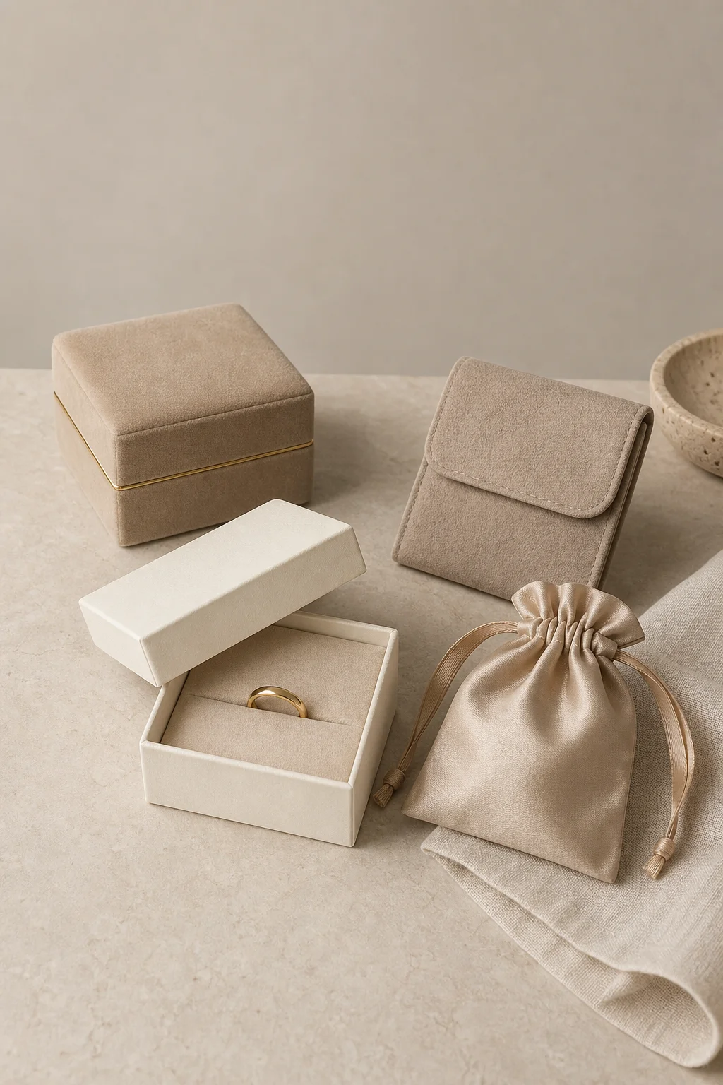
A light neutral range — beige velvet rigid box with a gold trim seam, an ivory box open on a sand insert, a beige satin drawstring pouch and a taupe suede flap pouch
A beige jewelry box or pouch is not a construction but a colour family applied across every construction: rigid boxes, flip-lid boxes, ring boxes, drawstring pouches, flap pouches and paper sleeves, each finished in a warm light neutral rather than a dark or saturated colour. The family runs from ivory and cream at the lightest end through sand and oatmeal to warm beige, greige and taupe, and each step changes both the mood of the packaging and the difficulty of making it.
Colour is specified in one of three ways: as a stock fabric or paper from a supplier range, as a dyed-to-match fabric, or as a printed Pantone-matched surface on paper or board. Stock ranges are the cheapest and most repeatable; dyed-to-match widens the choice but adds batch variation; printed surfaces give the tightest control on paper and the least on fabric.
Quick Answer: Beige jewelry packaging works when the tone is chosen for the piece, the material for the tone, and the approval is done on a physical swatch rather than a screen. Light neutrals are the most forgiving on the shelf and the least forgiving in production, so the decisions that matter are tone, material and a signed colour standard — in that order, before the run.
Four neutral families cover most briefs. The undertone decides which metals and which photography the packaging flatters.
Tone | Undertone | Pairs best with | Main risk |
|---|---|---|---|
Ivory and cream | Pale, slightly yellow or neutral | Gold, pearl, bridal and heirloom pieces | Reads as white in photography unless a second tone sits beside it |
Sand and oatmeal | Light with a visible grey grain | Silver, matte gold, natural and organic collections | Grain can print unevenly on coated papers |
Warm beige | Yellow-brown, mid light | Gold, warm-toned stones, ready-to-wear lines | Shifts visibly between fabric batches |
Greige and taupe | Grey with a warm cast, mid tone | Silver, platinum, minimal and unisex lines | Turns cold or muddy under the wrong lighting |
Two combinations dominate actual orders: a beige gold jewelry packaging box, where a warm beige surface carries gold foil or gold trim and the light tone reads as deliberate rather than unfinished; and a greige or taupe set built for silver. A jewelry box beige tone or a jewelry box ivory finish chosen for a gold collection looks washed out beside a platinum line — the tone and the metal are one decision, not two.
The same beige behaves differently on every substrate. The differences below show up in a sample, not only on a swatch card.
Material | How the tone reads | Wear and handling behaviour |
|---|---|---|
Velvet | Deep and rich, changes with the pile direction | Holds marks and finger trails longest; brushing recovers it |
Suede | Matte and even, closest to the flat swatch | The most stable of the fabrics in a light tone |
Satin | Luminous, the tone shifts across the fold | Shows pulled threads and crease lines |
Microfiber | Flat and even, slightly cooler | The cleanest light surface for printing and debossing |
Coated paper and board | Exact to the printed reference | Edges chip where a light tone meets dark corrugate |
PU leather | Uniform and slightly reflective | Resists soil best but creases show at the hinge |
The pattern is consistent: the more surface depth a material has, the more the tone moves when handled — which is why a beige jewelry packaging programme usually fixes its tone on suede or coated board and matches velvet and satin to it afterwards.
Light neutrals fail for reasons dark packaging never encounters. Five of them account for most complaints.
Handling marks. A light velvet or suede records the oils on a hand, so wrapping and packing stations need clean gloves and a no-pressure handling rule.
Glue show-through. Adhesive that would be invisible behind a dark wrap can telegraph through cream or sand as a faint outline, so light-toned rigid boxes are where the wrap material is chosen partly for its opacity.
Batch variation. A beige two steps warmer than the previous order is visible on a shelf even though it would disappear in a dark tone, so a signed standard has to travel with every reorder.
Edge and transit scuffing. A light box against dark corrugate shows every knock, and the carton liner matters as much as the box does.
Low contrast for decoration. On a light base there is less room to hide an imperfect impression or a faint edge of a printed panel.
None of these is a reason to avoid light tones; each is a reason to specify them deliberately, and the brief that produces a clean beige run usually names the material, the tone route and the tolerance in writing.
A pale surface changes what decoration is worth doing, and both sides of that trade-off are real.
Advantages of a light base:
Foil contrast. Gold and rose-gold foil read strongly on beige, and the darker the base within the neutral range, the stronger the effect.
Blind deboss. Tone-on-tone embossing shows as shadow rather than colour, so it survives a light tone without adding ink.
Ink accuracy. Dark ink on a light base is the easiest print to hold to reference, and small type stays legible where it would fill in on a dark fabric.
Photographic honesty. What the buyer sees in a photo is close to what arrives, because no deep pile changes the tone with the light angle.
Drawbacks of a light base:
Weaker metal foils. Silver foil on ivory is subtle to the point of vanishing; the effect is usually bought with a darker neutral or a larger mark.
No margin for imperfection. A foil edge, a print halo or a registration slip is more visible than on a dark ground.
Screening limits. Fine halftone or gradient detail fills in on fabric and muddies, without depth to hide it.
Colour-match load. Every decorated piece is judged against the base tone as well as the artwork, which adds an approval step.
The practical rule is that decoration on a light neutral is judged by contrast, not quantity: one well-placed foil or deboss carries further than a fully printed panel.
Four formats carry the neutral range most convincingly, each answering a different merchandising need.
The flip-lid box. A beige jewelry packaging box flip lid bow tie format is the classic gifting build: a two-part lid, a ribbon bow, and a light body that lets the ribbon carry the accent colour.
The ring box. An ivory jewelry box is the bridal default — an elegant jewelry ring box ivory tone with a gold band — and the light interior lets a stone read without competition.
The satin pouch. A jewelry satin beige pouch suits pieces sold without a box, and the sheen gives a light tone surface interest that flat paper does not have.
The personalised bag. A beige personalized jewelry bag is the common first step for a brand adding its name, because the mark can be small, tone-on-tone and still readable.
Mixing formats inside one neutral range works better than mixing tones inside one format: a brand running an ivory ring box, a sand pouch and a greige rigid box has a system, while three different beiges in the same box is a colour problem.
Colour cannot be checked from a technical drawing, so light-neutral programmes need their own approval step. The workable sequence has four stages. The tone is agreed on a physical substrate swatch — the actual fabric or printed board, not a screen image and not a Pantone chip alone, because a chip carries no texture. A pre-production sample is then made in the intended material with the decoration applied, so the tone is judged under foil as well as on its own. That approved sample becomes the colour standard: one physical copy with the buyer and one with the supplier, referenced on every later order. Reorders are checked against that standard rather than against the previous shipment, because comparing to the last shipment lets tone drift one acceptable step at a time.
Two practical notes belong in the same conversation. Light-tone packaging should be approved under the light it will be sold in, since a beige that looks warm in a showroom can look grey in daylight. And where the packaging has to match a brand asset such as a printed card or a textile ribbon, the base tone and the accessory should be approved together.
MOQ follows the material, not the colour. A light tone from a stock range carries the same minimum as the same construction in any other colour. A dyed-to-match fabric is where the minimum rises, because the dyeing run has to justify itself — which is why new neutral programmes usually start on a stock tone and move to a custom one once volumes are known.
Colour matching is a service, not a line item to skip. Ask what the tone tolerance is, how it is measured, and what happens on a reorder that falls outside it. A supplier that answers those three questions precisely has run light tones before.
Lead time runs on the decoration. Cutting, wrapping and stitching of a light neutral move at normal speed; foil, deboss, printing and personalisation add the days. The step that surprises buyers is colour approval itself, which sits before production and cannot be compressed afterwards. The wider sourcing fundamentals — minimums, sampling, tiered pricing and supplier qualification — are set out in the 2026 B2B sourcing guide for small and growing brands.
Q: Does beige packaging get dirty faster than dark packaging?
A: It does not soil faster, but it shows soil sooner. Prints, transit scuffs and handling marks that a dark surface hides are visible on a light one, so carton lining, glove handling at packing and edge protection matter more on a neutral programme.
Q: Should the tone be ivory, sand or warm beige?
A: Choose it against the metal and the stone rather than against a trend. Warm beige and sand flatter gold; greige, taupe and cooler ivories flatter silver and platinum; very pale ivory is the bridal default but needs a second tone beside it or it photographs as white.
Q: Can a light tone be printed instead of dyed?
A: On paper and board yes, and printing gives the tightest colour control. On velvet and suede no — the tone comes from the fabric, so it is either a stock colour or a dyed-to-match run, and dyed-to-match is what raises the minimum order.
Q: How do I stop the colour drifting between reorders?
A: Keep a signed physical colour standard with both the buyer and the supplier, reference it by number on every order, and check each new shipment against that standard rather than against the last delivery.
Beige jewelry packaging is a colour family rather than a construction, applied across rigid boxes, flip-lid gifting boxes, ring boxes, pouches and sleeves. The choices that decide whether it works are the tone within the neutral range, the substrate that carries it, and the way the colour is approved. Warm beige, sand and ivory flatter gold; greige, taupe and cooler ivories flatter silver and platinum. Suede, coated board and microfiber hold a light tone most predictably, while velvet and satin move with handling and with the angle of the light. The production risks are specific to light colours — handling marks, glue show-through, batch variation, transit scuffing and low contrast for decoration — and each is managed by specification rather than by supplier choice. Decoration is judged by contrast: a single gold foil or a blind deboss carries further on beige than a full printed panel, and the mark is usually smaller. The colour itself needs a physical standard, agreed on the real material, held by both sides and checked on every reorder, because a neutral that drifts one acceptable step at a time is the one failure nobody catches in a sample.
Utouch Packaging produces custom jewelry packaging in light neutral tones — velvet, suede, satin and microfiber boxes and pouches, printed paper and board, and personalised marks in foil or deboss — with colour approved on the production material before the run and a signed standard kept for reorders. For wholesale and custom enquiries, visit the Utouch Packaging contact page or reach the export team through Xiamen Yu Touch Imp. & Exp. Co., Ltd.
