
Views: 0 Author: Site Editor Publish Time: 2026-09-12 Origin: Site


Article Intro: Black jewelry packaging is the default of the premium shelf — the black box, the black bag, the black velvet pouch that let the metal do the talking. For jewelry brands, black is less a colour choice than a positioning choice: it frames gold and silver better than any other surface, photographs consistently, and reads as luxury without a word of copy. This guide covers why black works, the black finishes and materials, the colour pairings that sell, customization on black surfaces, and the wholesale notes for building a black packaging line.
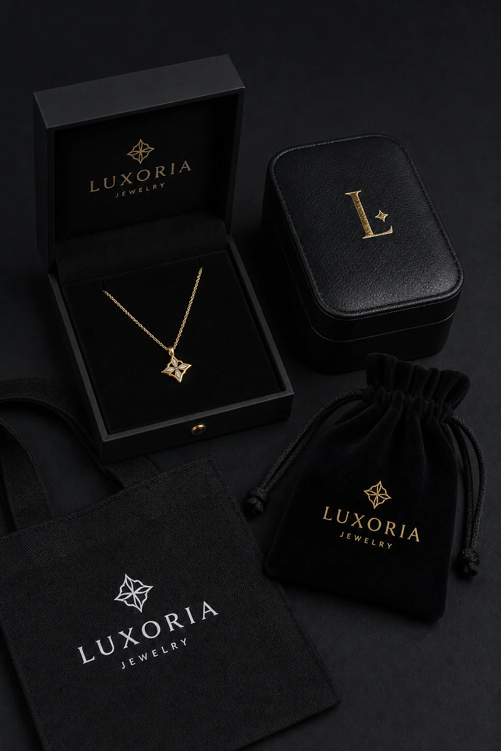
The black line — matte box, leather box, velvet pouch, cotton bag
Black jewelry packaging is the black tier of the packaging line: rigid boxes with matte or gloss black finishes, black leather and PU boxes, black velvet pouches, black cotton and canvas bags, and black dust bags. The colour runs across the whole line, which is what makes it a strategy rather than a product — a brand that commits to black supplies every piece with the same visual language.
The mechanism is contrast. Gold, rose gold, and silver all read as brighter against black than against any other background, and the black surface hides the scuffs and handling marks that show up on light packaging. That combination — brighter metal, cleaner wear — is why black has stayed the first colour of jewelry packaging across markets and price points.
Four factors keep black at the front of jewelry packaging:
Contrast that sells the metal: The piece is the product, and black gives it the strongest visual separation — the same reason display cases and photography setups default to dark backgrounds.
Consistent photography and unboxing: Black packaging photographs the same way in every light, which matters for e-commerce listings and customer content. Premium presentation has a measurable effect on sharing: nearly 40% of online shoppers say they would share an image of a purchase on social media if it arrived in premium, gift-like packaging — and a black box is the most reliably premium frame.
Market evidence: Across the wholesale market, black lines are consistently the strongest sellers — black packaging boxes and black velvet jewelry boxes are repeatedly cited among the best-performing jewelry packaging formats.
Occasion-neutral: Black suits proposals, anniversaries, men's lines, and everyday retail at once, so a brand can run one black line across every occasion instead of a different colour per season.
A black line usually covers five formats:
Format | Typical black build | Role in the line |
|---|---|---|
Black jewelry box | Rigid board with matte or gloss black wrap, black velvet insert | The hero box for retail and gifting |
Black leather and PU box | Black leatherette over rigid board, foil logo | Premium and men's lines |
Black velvet pouch | Black velvet with satin drawstring | Protection and travel |
Black cotton bag | Black cotton or canvas with printed or foiled logo | Retail carry and market use |
Black dust bag | Black cotton or satin with drawstring | Storage and shipping protection |
Running the colour across all five is what separates a black brand from a brand with a black box — the customer meets the same surface at the counter, in the bag, and at home. A black jewelry gift box carries the same build with the gift-first details — ribbon, fitted insert, and message card — while black cotton drawstring bags and a black jewelry packaging bag handle the storage and carry ends of the same line.
Black is a family, not a single surface, and the finish decides the positioning:
Matte black: The modern premium default — soft, fingerprint-resilient, and the surface that suits gold foil best.
Gloss black: The mirror-look finish that reads as classic luxury; it shows handling marks, so it suits protected retail environments rather than shipping-first formats.
Black velvet: The tactile tier — deep light absorption that makes metal glow, used for pouches, inserts, and box linings.
Black leatherette and PU: The black jewelry boxes leather tier — the structured, wipeable surface for leather-style boxes and travel cases, where debossed monograms replace foil.
Black frosted and translucent black: The softer, contemporary look where a hint of depth replaces full opacity — a black frosted jewelry bag or pouch reads modern without reading cheap.
Choosing between them is a two-question decision: how the box will travel (matte and velvet hide wear; gloss does not), and how the logo will be applied (foil pops on matte, debossing reads on leather, print needs a coated surface).
Black is rarely shipped alone — the accent colour defines the brand:
Black and gold: The classic luxury pairing and the most requested combination — a black and gold jewelry box carries warmth and heritage at once, and gold foil on matte black is the single most photographed packaging combination in jewelry.
Black and silver: The cooler, modern pairing for contemporary lines and men's collections.
Black and red: The high-contrast pairing for romance and seasonal lines — a black and red jewelry box reads as bold and gift-oriented, and suits proposal packaging.
Black and white: The editorial pairing — minimal, graphic, and effective for younger fashion lines.
Black and rose gold: The softer premium pairing, increasingly common in bridal and everyday-luxury ranges.
The practical rule: choose one accent and hold it across the line. Two accents split the identity, and a black line with a wandering accent colour loses the consistency that made black worth choosing.
Black surfaces change what branding methods work:
Gold and silver foil: The standard for matte and velvet surfaces — high contrast, sharp edges, and a premium read at any run size.
Debossing and blind emboss: The subtle route on leather and PU, where a mark in the surface reads better than a printed logo.
White and metallic print: The option for cotton and canvas bags, where the ink sits on the fabric rather than the box.
Interior branding: On black boxes, the interior is often the surprise — a contrasting lining, a printed message, or a coloured insert against the black shell.
The sample matters more than usual on black: foil adhesion, deboss depth, and ink opacity all behave differently on matte, gloss, velvet, and canvas, which is why a black line should be sampled on the actual surface before production.
Black packaging behaves differently in the two selling channels, and the line is usually specified for both.
In retail, the black box is a display tool: it sits on the counter as a dark island among lighter packaging, and the open box creates the contrast that makes a piece visible from across the room. Retailers often pair the black box with a black bag so the customer leaves with a single, coherent object, and the black dust bag extends the look into the customer's own storage.
In e-commerce, black packaging carries the listing images and the unboxing moment. The black background is the standard for jewelry photography because it flatters every metal, so a package that matches the photography keeps the experience consistent from screen to hand. Black also hides the marks of shipping better than light packaging when the finish is matte or velvet, which reduces the number of "arrived damaged-looking" complaints that have nothing to do with the product.
The practical implication: specify the black line once and use it in both channels. A brand that runs a lighter retail box and a black shipping box creates two visual identities for one product — and the customer only remembers one of them.
Three practical points when buying black:
Match the blacks: If the line includes a box, a bag, and a pouch, specify that the blacks match across materials — a blue-black box next to a warm-black bag is the most common visible defect in a black line.
Plan for marks: Black gloss and black leatherette show handling marks in transit; specify protective wrapping and confirm it at inspection.
Combine the order: Boxes, bags, and pouches in the same black ship together and spread the freight. The sourcing fundamentals — minimums, lead times, and supplier qualification — are covered in the 2026 B2B sourcing guide for small and growing brands.
Q: Is a black jewelry box better than a white one?
A: Neither is universally better — black frames metal more strongly and hides handling marks, while white reads clean and minimal. Black is the safer default for premium positioning and photography.
Q: What pairs best with a black box?
A: Gold foil on matte black is the classic; silver suits modern lines and red suits seasonal gifting. Choose one accent and hold it across the whole packaging line.
Q: Does black packaging cost more?
A: The base cost is similar to other colours — black wraps and fabrics are standard stock. The cost difference comes from the finish (gloss and specialty blacks) and the logo method, not the colour itself.
Black jewelry packaging is the colour that frames the product: the black box, bag, and pouch that make gold and silver read brighter and make every unboxing photograph consistently premium. The finish decides the positioning — matte for modern luxury, gloss for classic, velvet for tactile — and the accent colour decides the identity, with black and gold as the pairing that still leads the market. Build the black across the whole line, match the blacks between materials, and sample on the real surface: the colour is simple, and the execution is what carries it.
Utouch Packaging manufactures custom black jewelry boxes, pouches, and bags — matte, gloss, velvet, and leather finishes with foil, deboss, and print branding — with samples approved before production. For wholesale and custom inquiries, visit the Utouch Packaging contact page — the team responds with material guidance and tiered quotes.
