
Views: 0 Author: Site Editor Publish Time: 2026-10-14 Origin: Site


Article Intro: A pink packaging order is rarely a colour choice; it is a tolerance problem. Pink sits in the low-chroma region where the eye resolves hue drift most sharply, and one approved reference reads three ways once it lands on coated board, on velvet and on satin. This guide treats blush, rose and pastel as specifications to be bounded rather than names to be repeated — how to state the tolerance, which substrate the standard is judged on, and where pink goes wrong on a production floor.
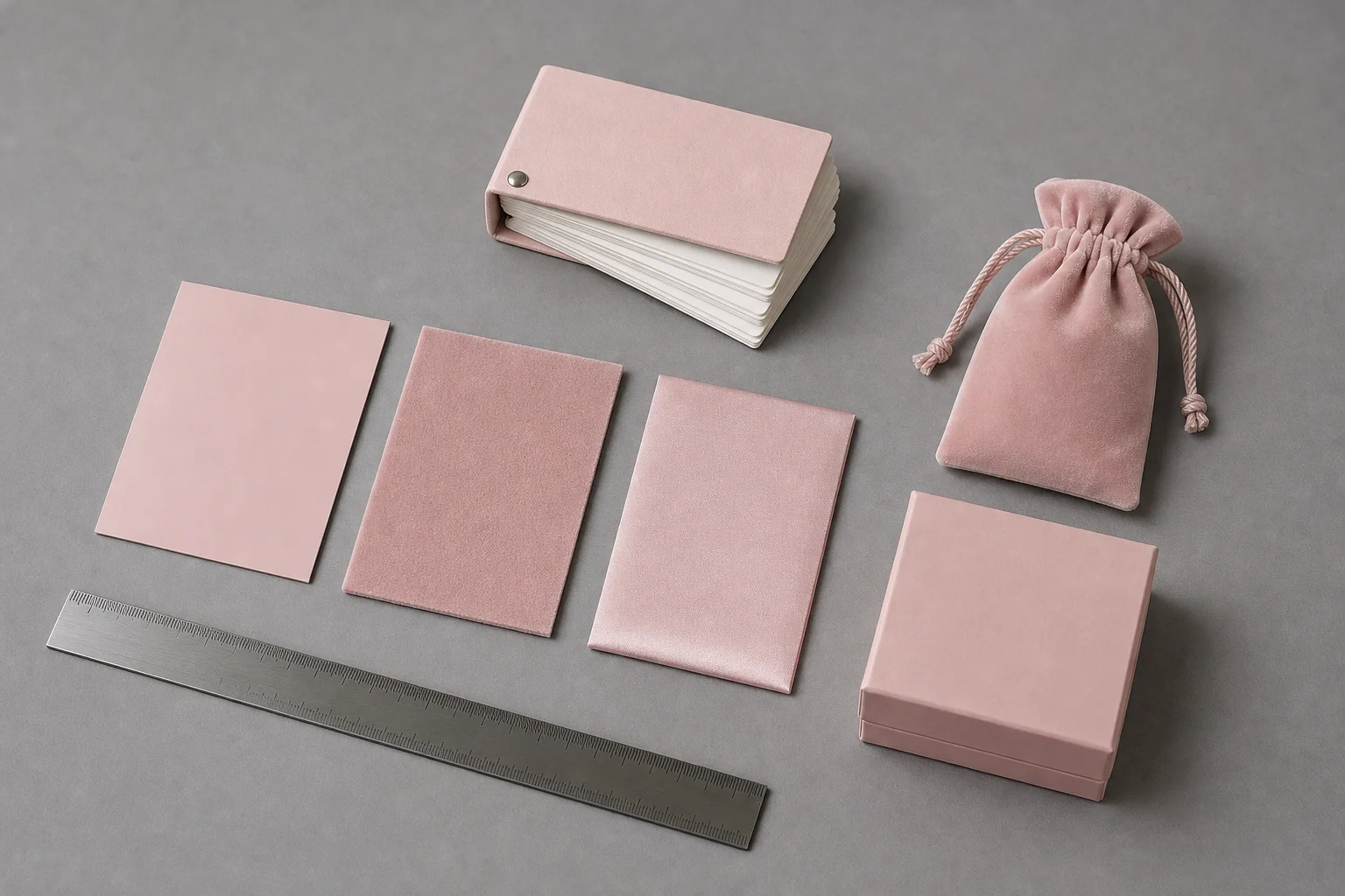
One reference tone, three substrates: coated board, raised velvet and satin each return a different pink from the same master.
A pink jewelry packaging order is specified by holding jewellery to a bounded range rather than by naming a colour. The category covers rigid boxes, pouches, fitted inserts and printed cards in blush, rose, pastel or dusty tones, and what separates one supplier's pink from another's is not the tone but how it was fixed: against a physical standard, on a named substrate, with a stated tolerance. Pink is a range rather than a point, and the substrate is part of the definition.
Quick Answer: Pink is not a colour to name; it is a range to bound. Fix one physical standard, record the substrate it was approved on, and state the tolerance beside it, or two suppliers will deliver two pinks from the same reference.
Dark colours are forgiving: a black box hides drift because little chroma is left to drift within, and a deep tone survives a small hue shift unnoticed. Pink sits close to neutral on the chroma axis, where the eye resolves hue angle most sharply, so a shift that would vanish inside a black appears as a visibly different pink.
The direction of the drift is predictable. A blush nudged toward yellow reads as peach; nudged toward blue it reads as mauve, older and more muted; pushed toward neutral it greys out, and the packaging's perceived value drops with it. None of these shifts is large in measurement terms, and all three change how the packaging is read on a shelf.
There is a quieter effect. Samples are usually judged against a standard one after the other rather than side by side, and memory is a poor colour reference: a sequential judgement exaggerates a difference a simultaneous comparison would dismiss.
Surface | How one approved reference reads on it | What belongs on the order |
|---|---|---|
Coated board | Ink sits on a sealed, reflective face; pink reads clean, slightly lighter, chroma holds | Board grade, coating and printed proof |
Uncoated or recycled board | The sheet draws ink into the fibre; pink reads duller, with visible chroma loss | The sheet itself, and a wider band |
Velvet | A raised surface absorbs light instead of returning it, lifting lightness and softening saturation | A dyed fabric standard, not a printed one |
Satin | A directional sheen returns light at one angle, so the tone shifts as the pouch tilts | The weave, and the face approved on |
The velvet and satin rows share a root cause: a surface that reflects light unevenly returns a colour that depends on where the observer stands. Published textile colourimetry shows measured colour depends on the illuminating and viewing geometry, and that the diffuse and directional arrangements built into commercial instruments behave differently on textured samples. A matte surface therefore tends to measure lighter and less saturated than a glossy one of the same nominal colour, so a pink approved on a card can look deeper once dyed onto velvet. That is why the substrate belongs in the standard: a specification reading only "blush pink" lets the supplier match the card, the one surface the finished pouch is not made from.
Three practical routes pin a pink down, and they are not interchangeable.
Route | What it closes | What it leaves open |
|---|---|---|
A printed swatch on the production board | The press and ink are proven on the actual sheet | Fabric routes; a reorder on a later press run |
A colour-system reference with a named substrate | Both sides work from one code, so a reorder re-quotes without a sample | How the code lands on another material, and who arbitrates a mismatch |
A numerical tolerance with a stated geometry | Whether a delivered lot passes, without a subjective argument | Whether the pass band is comfortable to the eye |
The third route needs a method behind it. ASTM D2244, the standard practice for calculating colour tolerances and small colour differences from instrumentally measured colour coordinates under daylight illumination, supplies the arithmetic: it reduces readings to one figure comparable against a limit written on the order. Without a stated geometry, that figure is not comparable between two instruments — one lot can be reported both passing and failing on the same day. A dyed trial length is the informal fourth route and the cheapest insurance here — it costs a small fraction of a bulk dye lot rather than the price of a second one (illustrative).
Light decides the verdict, and the approval is the control point: everything after it is reproduction, which can only be as good as the standard it reproduces.
A reference calculated under daylight illumination and a pouch judged under a warm shop spot are not the same measurement. Two effects explain most disputes: the colour of the light itself, which pushes a cool pink toward peach under a warm source and the reverse under a cool one, and the mismatch between a pair of samples under one light and the same pair under another. The industry's tool for the second effect is the ISO 105-A02 grey scale for assessing change in colour, which sets reference pairs so two observers describing one difference reach the same grade. Side-by-side beats sequential for the same reason: a standard and a submission in contact, viewed and turned together, expose the difference memory smooths away.
The record belongs with the order: which reference was approved, on which substrate, under which light, the tolerance and its geometry, and who signed. Keep the signed standard as a consumable — a card left on a windowsill for months stops being a standard, so a retained set re-checked periodically beats one labelled master.
Where this comes from. The material below reports published third-party research rather than an order placed with this supplier. A 2005 study compared instrumentally measured colour differences against textile colour acceptability judged by ordinary observers; a 2011 study examined how a spectrophotometer's measuring geometry changes the reading taken from textile samples of differing surface texture.
How the comparison was assembled. The acceptability study prepared ninety-six pairs of nylon samples across four standard colours — red, yellow, green and blue — each at two lightness levels, spanning colour differences from 0.15 to 4.01 in CIE94 units. Observers without colour training judged each pair, so the result describes what an average viewer accepts rather than what a trained colourist can resolve.
What the panel returned. The judgements did not collapse onto one cut-off value. The same measured difference could be accepted in one colour region and rejected in another, and the lightness level moved the verdict again, so measured difference and human acceptability are related but not interchangeable.
Why no single figure holds. Commercial spectrophotometers use either a diffuse arrangement, which floods the sample with light before reading it, or a directional one, which illuminates and views at fixed angles. The two behave differently on samples of differing surface texture, so measured colour is not independent of geometry and a tolerance figure with no stated geometry is not transferable.
What a buyer takes from it. Write the tolerance as a number with its geometry attached, not as an adjective, and treat it as a screening tool rather than a verdict: a lot inside the band can still be rejected where that colour is judged critically. On a low-chroma tone the band should be tighter.
Colour in a print or textile operation is assessed at several points rather than once at the end — incoming material, colourant preparation, the run itself and the final check — so a fault starting early usually surfaces late. Four patterns account for most pink disputes.
The first is the print route's dependence on what sits underneath. Pink is normally a light ink over a white base on board, so a run laying ink thin produces a lighter pink rather than a paler one, because more base shows through and the chroma narrows. The second is the substrate's appetite for ink: on an uncoated or recycled sheet the same pink collapses toward mud, and the fix is a base coat rather than more ink.
The third is a change of process presented as a change of nothing. A pink dyed into velvet and a pink printed onto velvet are two different controls, set in the dyebath and on the press respectively, so a reference approved for one does not govern the other. The fourth is drift across time: a reorder months later runs against a different dye lot or a re-mixed ink, and a low-chroma tone shows it first. Pale tones are also the first to fade toward the substrate beneath them, so hold the retained standard against every new lot: drift is invisible unless both are seen together.
Where pink earns its place | What it asks in return |
|---|---|
Signals a soft, personal or gift-oriented line without a printed word | Carries a strong category association not every brand wants |
Sets jewellery on a light ground that flatters gold and rose-gold tones | Light grounds show handling marks and transfer more readily |
Reads clearly in photography and on a bright shelf | Exposes colour drift a dark tone would absorb |
Extends an existing colour programme across a full range of formats | Each format brings its own substrate and its own match |
A tight stated tolerance is cheap to write and improves reorder confidence | Low-chroma tones are least forgiving if the tolerance is left open |
Written before a purchase order, these entries close the gaps that otherwise appear in the first production photographs.
Decision | Entry that settles it |
|---|---|
The reference | The physical standard or colour code, with its version or date |
The substrate | The exact material the standard was approved on, not the material family |
The route | Printed, dyed or coated, since each carries a different control |
The tolerance | The permitted difference, with the measurement geometry alongside it |
The viewing light | The light the visual check is performed under |
The retained standard | Who holds the signed master, and when it is re-checked |
Colour sign-off sits inside a longer sampling sequence rather than standing alone, and the published case studies and FAQ collection follows how a brief, a sample and an approval move through that sequence before an order ships.
Why does the same pink look different on a box and a pouch? Because the substrate is part of the colour. Board returns light from a sealed film, velvet absorbs it into a raised surface and satin reflects it directionally, so one reference lands at three readings. Match each substrate to its own standard.
Can a colour reference alone be used for a reorder? Only if the substrate travels with it. A code identifies an intention, not a result; without the named material, a second supplier can match the code and still deliver a different pink.
What tolerance should a pink order carry? Tighter than a dark tone of the same range, because the eye is more sensitive to hue drift at low chroma. Fix the number with its geometry beside it.
Does a pink pouch fade faster than a black one? A pale tone has less depth to lose before the substrate dominates, so fading shows earlier on pink. Compare the signed standard against each new lot.
Is a dyed pink or a printed pink easier to control? Neither is inherently easier; they are controlled at different stages. Printing is set on the press, dyeing in the bath, and a standard approved for one does not govern the other.
Pink is the least forgiving tone in a jewellery packaging range, not because it is difficult to produce but because it is difficult to define. Its low chroma leaves the eye unusually sensitive to hue drift, and its three common substrates — coated board, velvet and satin — return three readings of one approved reference. A programme treating pink as a specification rather than a name therefore carries three things into the order: a physical standard, the substrate it was approved on, and a tolerance with its measurement geometry attached. Approve it under a stated light and keep the signed standard, and the tone that arrives in bulk is the tone that was chosen.
A physical colour standard and the reference material behind it are published by Utouch Packaging. A specific blush or rose tone can be matched against a real substrate through the contact page, and volume terms for a dyed or printed run are listed on the storefront at Xiamen Yu Touch Imp. & Exp. Co., Ltd.
